 HTML resume built with Bootstrap CSS framework." width="359" height="512" />
In this tutorial we’ll be building HTML resume using Bootstrap 5.
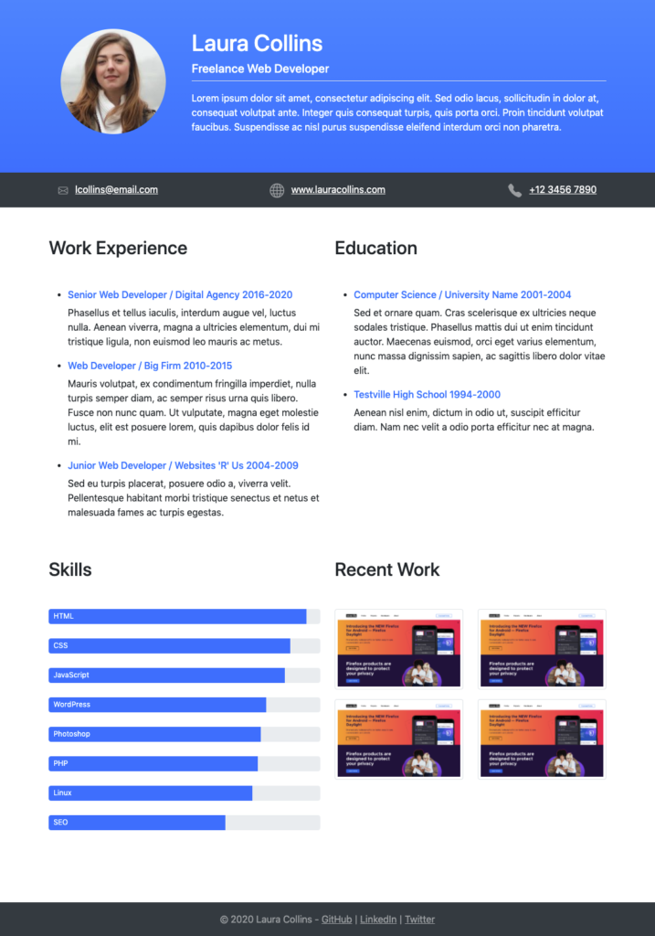
Here’s what the finished product will look like:
HTML resume built with Bootstrap CSS framework." width="359" height="512" />
Let’s get started by loading Bootstrap into a HTML file as follows:
html> html lang="en"> head> meta charset="UTF-8" /> meta name="viewport" content="width=device-width, initial-scale=1"> title>Bootstrap Resume title> link rel="stylesheet" href="https://stackpath.bootstrapcdn.com/bootstrap/5.0.0-alpha1/css/bootstrap.min.css" integrity="sha384-r4NyP46KrjDleawBgD5tp8Y7UzmLA05oM1iAEQ17CSuDqnUK2+k9luXQOfXJCJ4I" crossorigin="anonymous"> head> body> body> html>Code language: HTML, XML (xml)Next we’ll add markup for the section that contains a profile picture and text overview in a two column layout:
header class="bg-primary bg-gradient text-white py-5"> div class="container"> div class="row"> div class="col-md-3 text-left text-md-center mb-3"> img class="rounded-circle img-fluid" src="https://i.pravatar.cc/175?img=32" alt="Profile Photo" /> div> div class="col-md-9"> h1>Laura Collins h1> h5>Freelance Web Developer h5> p class="border-top pt-3">Lorem ipsum dolor sit amet, consectetur adipiscing elit. Sed odio lacus, sollicitudin in dolor at, consequat volutpat ante. Integer quis consequat turpis, quis porta orci. Proin tincidunt volutpat faucibus. Suspendisse ac nisl purus suspendisse eleifend interdum orci non pharetra. p> div> div> div> header>Code language: HTML, XML (xml)Underneath the header we’ll add a section with email, website, and phone number links.
Bootstrap now includes its own custom SVG icon library that can be found here. Click on an icon you would like to use and copy the code provided. By default the width and height of the icons is 1em but this has been increased to 1.5em so they appear slightly larger:
nav class="bg-dark text-white-50 mb-5"> div class="container"> div class="row p-3"> div class="col-md pb-2 pb-md-0"> svg width="1em" height="1.5em" viewBox="0 0 16 16" class="bi bi-envelope" fill="currentColor" xmlns="http://www.w3.org/2000/svg"> path fill-rule="evenodd" d="M0 4a2 2 0 0 1 2-2h12a2 2 0 0 1 2 2v8a2 2 0 0 1-2 2H2a2 2 0 0 1-2-2V4zm2-1a1 1 0 0 0-1 1v.217l7 4.2 7-4.2V4a1 1 0 0 0-1-1H2zm13 2.383l-4.758 2.855L15 11.114v-5.73zm-.034 6.878L9.271 8.82 8 9.583 6.728 8.82l-5.694 3.44A1 1 0 0 0 2 13h12a1 1 0 0 0 .966-.739zM1 11.114l4.758-2.876L1 5.383v5.73z"/> svg> a href="#" class="text-white ml-2">lcollins@email.com a> div> div class="col-md text-md-center pb-2 pb-md-0"> svg width="1.5em" height="1.5em" viewBox="0 0 16 16" class="bi bi-globe" fill="currentColor" xmlns="http://www.w3.org/2000/svg"> path fill-rule="evenodd" d="M0 8a8 8 0 1 1 16 0A8 8 0 0 1 0 8zm7.5-6.923c-.67.204-1.335.82-1.887 1.855A7.97 7.97 0 0 0 5.145 4H7.5V1.077zM4.09 4H2.255a7.025 7.025 0 0 1 3.072-2.472 6.7 6.7 0 0 0-.597.933c-.247.464-.462.98-.64 1.539zm-.582 3.5h-2.49c.062-.89.291-1.733.656-2.5H3.82a13.652 13.652 0 0 0-.312 2.5zM4.847 5H7.5v2.5H4.51A12.5 12.5 0 0 1 4.846 5zM8.5 5v2.5h2.99a12.495 12.495 0 0 0-.337-2.5H8.5zM4.51 8.5H7.5V11H4.847a12.5 12.5 0 0 1-.338-2.5zm3.99 0V11h2.653c.187-.765.306-1.608.338-2.5H8.5zM5.145 12H7.5v2.923c-.67-.204-1.335-.82-1.887-1.855A7.97 7.97 0 0 1 5.145 12zm.182 2.472a6.696 6.696 0 0 1-.597-.933A9.268 9.268 0 0 1 4.09 12H2.255a7.024 7.024 0 0 0 3.072 2.472zM3.82 11H1.674a6.958 6.958 0 0 1-.656-2.5h2.49c.03.877.138 1.718.312 2.5zm6.853 3.472A7.024 7.024 0 0 0 13.745 12H11.91a9.27 9.27 0 0 1-.64 1.539 6.688 6.688 0 0 1-.597.933zM8.5 12h2.355a7.967 7.967 0 0 1-.468 1.068c-.552 1.035-1.218 1.65-1.887 1.855V12zm3.68-1h2.146c.365-.767.594-1.61.656-2.5h-2.49a13.65 13.65 0 0 1-.312 2.5zm2.802-3.5h-2.49A13.65 13.65 0 0 0 12.18 5h2.146c.365.767.594 1.61.656 2.5zM11.27 2.461c.247.464.462.98.64 1.539h1.835a7.024 7.024 0 0 0-3.072-2.472c.218.284.418.598.597.933zM10.855 4H8.5V1.077c.67.204 1.335.82 1.887 1.855.173.324.33.682.468 1.068z"/> svg> a href="#" class="text-white ml-2">www.lauracollins.com a> div> div class="col-md text-md-right"> svg width="1.5em" height="1.5em" viewBox="0 0 16 16" class="bi bi-telephone-fill" fill="currentColor" xmlns="http://www.w3.org/2000/svg"> path fill-rule="evenodd" d="M2.267.98a1.636 1.636 0 0 1 2.448.152l1.681 2.162c.309.396.418.913.296 1.4l-.513 2.053a.636.636 0 0 0 .167.604L8.65 9.654a.636.636 0 0 0 .604.167l2.052-.513a1.636 1.636 0 0 1 1.401.296l2.162 1.681c.777.604.849 1.753.153 2.448l-.97.97c-.693.693-1.73.998-2.697.658a17.47 17.47 0 0 1-6.571-4.144A17.47 17.47 0 0 1 .639 4.646c-.34-.967-.035-2.004.658-2.698l.97-.969z"/> svg> a href="#" class="text-white ml-2">+12 3456 7890 a> div> div> div> nav>Code language: HTML, XML (xml)The main content section of resume will contain 2 evenly sized columns and 2 rows. Lets add the markup for this layout and then we can populate each of the individual sections:
main class="container"> div class="row"> div class="col-md mb-5"> div> div class="col-md mb-5"> div> div> div class="row"> div class="col-md mb-5"> div> div class="col-md"> div> div> main>Code language: HTML, XML (xml)The “Work Experience” section contains a simple unordered list. The only Bootstrap used is a margin on the primary heading and text color on the sub headings:
h2 class="mb-5">Work Experience h2> ul> li> h6 class="text-primary">Senior Web Developer / Digital Agency 2016-2020 h6> p>Phasellus et tellus iaculis, interdum augue vel, luctus nulla. Aenean viverra, magna a ultricies elementum, dui mi tristique ligula, non euismod leo mauris ac metus. p> li> li> h6 class="text-primary">Web Developer / Big Firm 2010-2015 h6> p>Mauris volutpat, ex condimentum fringilla imperdiet, nulla turpis semper diam, ac semper risus urna quis libero. Fusce non nunc quam. Ut vulputate, magna eget molestie luctus, elit est posuere lorem, quis dapibus dolor felis id mi. p> li> li> h6 class="text-primary">Junior Web Developer / Websites 'R' Us 2004-2009 h6> p>Sed eu turpis placerat, posuere odio a, viverra velit. Pellentesque habitant morbi tristique senectus et netus et malesuada fames ac turpis egestas. p> li> ul>Code language: HTML, XML (xml)In the “Education” section we’ll use the same HTML markup as the “Work Experience” section. As these two sections sit within the same row the content below will remain on the same line and not shift into space left by us having less content in the “Education” column:
h2 class="mb-5">Education h2> ul> li> h6 class="text-primary">Computer Science / University Name 2001-2004 h6> p>Sed et ornare quam. Cras scelerisque ex ultricies neque sodales tristique. Phasellus mattis dui ut enim tincidunt auctor. Maecenas euismod, orci eget varius elementum, nunc massa dignissim sapien, ac sagittis libero dolor vitae elit. p> li> li> h6 class="text-primary">Testville High School 1994-2000 h6> p>Aenean nisl enim, dictum in odio ut, suscipit efficitur diam. Nam nec velit a odio porta efficitur nec at magna. p> li> ul>Code language: HTML, XML (xml)In the “Skills” section we’ll use Bootstrap’s progress bars to give a visual representation of the knowledge level for each particular skill:
h2 class="mb-5">Skills h2> div class="progress mb-4" style="height:25px;"> div class="progress-bar bg-primary text-left pl-2" role="progressbar" style="width: 95%" aria-valuenow="95" aria-valuemin="0" aria-valuemax="100">HTML div> div> div class="progress mb-4" style="height:25px;"> div class="progress-bar bg-primary text-left pl-2" role="progressbar" style="width: 89%" aria-valuenow="89" aria-valuemin="0" aria-valuemax="100">CSS div> div> div class="progress mb-4" style="height:25px;"> div class="progress-bar bg-primary text-left pl-2" role="progressbar" style="width: 87%" aria-valuenow="87" aria-valuemin="0" aria-valuemax="100">JavaScript div> div> div class="progress mb-4" style="height:25px;"> div class="progress-bar bg-primary text-left pl-2" role="progressbar" style="width: 80%" aria-valuenow="80" aria-valuemin="0" aria-valuemax="100">WordPress div> div> div class="progress mb-4" style="height:25px;"> div class="progress-bar bg-primary text-left pl-2" role="progressbar" style="width: 78%" aria-valuenow="78" aria-valuemin="0" aria-valuemax="100">Photoshop div> div> div class="progress mb-4" style="height:25px;"> div class="progress-bar bg-primary text-left pl-2" role="progressbar" style="width: 77%" aria-valuenow="77" aria-valuemin="0" aria-valuemax="100">PHP div> div> div class="progress mb-4" style="height:25px;"> div class="progress-bar bg-primary text-left pl-2" role="progressbar" style="width: 75%" aria-valuenow="75" aria-valuemin="0" aria-valuemax="100">Linux div> div> div class="progress mb-4" style="height:25px;"> div class="progress-bar bg-primary text-left pl-2" role="progressbar" style="width: 65%" aria-valuenow="65" aria-valuemin="0" aria-valuemax="100">SEO div> div>Code language: HTML, XML (xml)By default text is centered aligned in progress bar elements which doesn’t look so great in this scenario. That’s why we’ve added text-left pl-2 to left align the text with some padding so it doesn’t sit hard against the edge.
In the “Recent Work” section we’ll display 4 website screenshots. The only new piece of Bootstrap used in this section is img-thumnail which slightly rounds the corners of the images, adds some padding, and a light gray border:
h2 class="mb-5">Recent Work h2> div class="row"> div class="col-md mb-3"> a href="#"> img class="img-fluid img-thumbnail" src="screenshot.png"> a> div> div class="col-md mb-3"> a href="#"> img class="img-fluid img-thumbnail" src="screenshot.png"> a> div> div> div class="row"> div class="col-md mb-3"> a href="#"> img class="img-fluid img-thumbnail" src="screenshot.png"> a> div> div class="col-md mb-3"> a href="#"> img class="img-fluid img-thumbnail" src="screenshot.png"> a> div> div> Code language: HTML, XML (xml)Let’s finish the page by adding a with some social links:
footer class="bg-dark text-white-50 text-center mt-5 p-3"> © 2020 Laura Collins - a href="#" class="text-white-50">GitHub a> | a href="#" class="text-white-50">LinkedIn a> | a href="#" class="text-white-50">Twitter a> footer>Code language: HTML, XML (xml)